Designing a poster presentation in PowerPoint®.
Important Tip: Always start with a new file or template
It's always best to start with a new, clean file or template rather than re-working an old poster file. An old file may contain unsupported fonts or have default settings altered in some way that isn't readily apparent. Genigraphics poster templates are updated to work with the most recent versions of PowerPoint and we recommend that you always download directly from our poster templates page. If your institution has a layout and color scheme that you are required to use, start with a fresh template from your graphics department - we can print that for you too!
Important Tip: When collaborating, use a master file
If several authors are involved with creating and editing content, designate one person to retain the master file. Send copies out for contributions and comments, then copy and paste any revisions back into the original master file. This ensures that the file you eventually print isn't passed back and forth between different PowerPoint versions, or between a Mac and PC, as that can cause a number of problems.
Less is more
Use a title that is succinct and in plain English - "How honey bees fly" will be more effective than "A critical analysis of the flight mechanisms and aerodynamic performance of Apis mellifera in relation to body mass". And potential viewers are more likely to stop and read a poster comprised of short summary statements, or bullet points, than one containing an entire 10,000 word paper.
Don't overcrowd your poster! Include enough empty space throughout the poster so that various elements can be easily distinguished from one another and visual navigation remains clear.
Get straight to the point
After the title, viewers will almost certainly read your Conclusions next. Set that section to a larger font size to draw their attention and use a minimal number of bullet points to quickly summarize the content with brevity and clarity.
What to include and exclude
Your society, or the conference organizers, will often have specific requirements as to what needs to be on the poster. A typical format includes: Title, Authors and their Affilaitions, Introduction, Methods and Materials, Results, Discussion, Conclusion, and References. Don't include a copy of the abstract unless it's absolutely required; it's mostly redundant and a waste of valuable space. If it is required, use a very small font size or ask if it can be attached to the bottom of the board as a separate printout. Likewise, state "References available upon request" if that is allowed or else include them using a 12pt or smaller font.
If your poster session includes Genigraphics ePosters, hosted at our ResearchPosters.com service, each poster board will have a card attached with your poster number, title, and a QR Code that links to the online listing for your poster. The listing includes the full abstract text, contact information, author biography, and a high-resolution digital copy of your poster.
QR Codes are easy to create and you can place them on your poster as an effective way to provide a "Scan for video demonstration" link to a YouTube or Vimeo page, or a "Scan for the complete abstract" link to a pdf file stored in the cloud. Search "QR Code generator" or you can follow this link for a simple, free generator that allows you to set size and colors.
Other considerations
- Intuitive sequence: Use column formats that flow top to bottom, left to right.
- Keep it simple: Focus on a few main points and edit ruthlessly.
- Emphasize visually: Use relevant images, tables, and graphs.
- Plan Ahead: Allow yourself plenty of time for reviews and revisions.
Determine the correct size
Before you add content, always check that you are preparing your poster in the dimensions and orientation (portrait or landscape) that are allowed for your meeting. Specifications may change from year to year so don't rely on what was used at previous meetings. You may have received poster guidelines when your abstract was accepted or they may be published on the meeting website. If unsure, it's best to ask.
Printing posters larger than 56"
PowerPoint allows a maximum dimension of 56 inches in either direction. To print a poster larger than 56 inches, you can use half scale measurements. For instance, use an 18x36 slide size to produce a 36x72 printed poster - just make sure that the slide size is proportional to the desired print size. Better yet, use one of our pre-sized poster templates.
Leave an inch or two
Before selecting a template, bear in mind that most poster session boards have a one-inch metal frame. Reducing the poster by a few inches allows it to mount flat on the board without the edges curling. If you are allowed a 48" x 48" space, we recommend using a 44" x 44" template. Similarly, for a 48" x 96" board, we recommend no larger than a 42" x 90" template. Click here to see a comparison of how they fit on a board.
Windows
Go to the Design tab, click Slide Size, click Custom Slide Size, and enter the desired width and height.
Mac
Go to the Design tab, click Slide Size, click Page Setup, and enter the desired width and height. Or go to File menu, Page Setup.
Choosing the right colors
The most important thing to remember about color combinations is contrast. Use a dark font on a light background for the main body text as this will be the easiest for your viewers to read. Black, dark gray, or dark blue text on a white or off-white background is a good choice for maximum acuity with minimal eye strain. For areas such as the title or section headers, use a light colored font on a dark background.
The colors on your monitor are "additive" - in other words, various wavelengths of projected light are combined to create a specific color. Blue and red make purple, red and green make yellow, blue/red/green combine to yield white, and so on. Printed colors, on the other hand, are "subtractive" - combinations of cyan, magenta, yellow, and black ink are layered to absorb light until a specific color is achieved. As a result, printed colors will always appear different, often somewhat darker, than what you see on your screen. The dark blues in PowerPoint tend to print with more of a purplish color. The oranges tend to print more reddish, or even toward brown. We designed the default color theme in our poster templates to use colors that are proven to print with high accuracy.
Using color for emphasis
Use color to associate related elements or highlight an important item. But try not to use more than two or three colors throughout the entire poster or you'll just cause visual confusion. A uniquely colored border is one way to draw focus to a specific area.
Other considerations
- Colors have varying psychological impact. Google search: color psychology chart.
- Use the poster's color theme throughout all charts and tables for consistency.
- Avoid large, distracting background images and patterns.
- Avoid using red and green in combination because some people have difficulty distinguishing between the two.
Explore the built-in color themes
Genigraphics poster templates have a number of built-in color themes. See the graphic below for how to explore the available options.
Windows
Go to the Design tab, click the down arrow in the Variants group. Click Colors, and choose one of the alternate color themes.
Mac
Go to the Design tab, click the down arrow in the Variants group. Click Colors, and choose one of the alternate color themes.
Choosing the right font
There are a variety of opinions about whether to use serif or sans-serif fonts for the body text of your poster. Many will tell you that serif fonts (Times, Garamond, Bookman) are easier to read in long blocks of text while sans-serif fonts should only be used for titles and section headers. However, while serif fonts are certainly more readable in documents and books that you are holding 12-18" from your eyes, sans-serif fonts are more legible on posters that are being read from three or more feet away. Besides, an effective poster shouldn't have long blocks of text.
For body text we recommend a humanist sans-serif font like Calibri, Franklin Gothic, or Gill Sans as these will be easier to read due to their wide counters and open apertures (Wikipedia definition: Counter (typography)).
Determining the correct font size
Titles are typically 72 point font or larger, with authors and affiliations in the 40-60pt range. To make the body text legible at 4-5 feet we suggest a minimum 28pt font and 32-40pt is ideal. If you are using a scaled template (for instance, a 24x48 template to print a 48x96 poster) keep in mind that your font sizes will be scaled as well. So a 16pt font will appear as 32pt when printed. View your poster file at 100% zoom (or 200% if scaled) and then step 4-5 feet away from your display. This will give you a good estimation of how your font choices will work in print.
Other considerations
- For consistency, use the same font for all body text.
- Use the same size font for like elements (i.e. - all section headers at 48pt)
- Try not to use more than two font types in the entire poster.
- Do not use all caps or all bolded body text as it is difficult to read.
- Do not use Comic Sans font. Ever. Seriously.
Embedding fonts
Genigraphics supports all of the TrueType fonts installed with Windows OS, Mac OS, and all versions of Microsoft Office. If you use custom fonts or non-standard TrueType fonts, you will need to embed the fonts within the file or upload the font file with your order.
Windows
To embed the fonts, click File | Save As | Tools | Save Options, then check the box for "Embed fonts in the file" and select the "Embed all characters" radio button.
Mac
Unfortunately, you cannot embed fonts in a Mac PowerPoint file. If you are using custom fonts, please include the font file(s) with your order.
Adding a text box
A simple method for adding a text box is to copy a block of text from your Word document, then return to your PowerPoint file, and either click Paste, type CTRL+C (Windows) or COMMAND+C (Mac) or right-click and select one of the Paste Options (other than "Picture").
Alternatively, go to the "Insert" tab of the Ribbon and select "Text Box". Click anywhere in your file and start typing.
Formatting a text box
There are numerous ways to format text boxes and controls are located in various parts of the Ribbon. You can also right click on a text box and select "Format Shape" to access a number of precision controls. Here you can set borders, fills, internal margins, dimensions, position, and much more. Use the "Resize shape to fit text" control to automatically adjust the height of the text box as you add or remove text.
Resolution & image quality
Place graphics such as digital photos or logo art in your poster file by selecting the "Insert, Picture" command or using standard copy & paste procedures. For best results all graphic elements should be a minimum of 150dpi (dots per inch) in their final printed size, and 300dpi is ideal. For instance, a 900 pixel x 1200 pixel image (check the image's file properties to see what size it is in pixels) could be sized to 6" high by 8" wide on your poster and you would end up with 150dpi.
To preview the print quality of images, select a magnification of 100% when viewing your PowerPoint poster file. This will give you a very good approximation of what it will look like on the printed poster. If you are laying out a large poster and using half-scale dimensions, be sure to preview your graphics at 200% to see them at their final printed size.
Using graphics from websites
Please note that graphics from websites (such as the logos on your hospital's or university's home page) will quite often only be 72dpi and are not suitable for poster printing.
TIP: Contact your media relations department for print quality logos. If they only have vector formats available, such as .ai or .eps, and you are unable to convert to a .jpg or .png format for use in your file, just upload the vector file with your order and ask us to convert it for you. We'll even send back a high-resolution graphic for your future use.
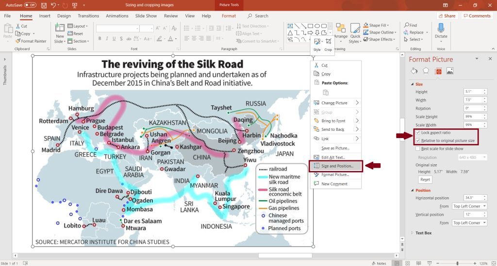
Sizing and positioning
In both Windows and Mac versions, right click on the image and select "Size and Position" from the menu to access controls for precisely sizing and aligning your images. In almost all instances, keep the "Lock aspect ratio" and "Relative to original picture size" boxes checked. Otherwise, resizing may create unnatural looking results, especially when adjusting photos of people.
Importing from Word or Excel
Whenever possible, create your tables or charts directly within your PowerPoint poster file. This ensures that they will print at high resolution when scaled to full poster size and they will automatically match the color theme for the rest of the poster. If the table or chart is quite simple, this often takes less time and effort than bringing an existing one in from Word or Excel.
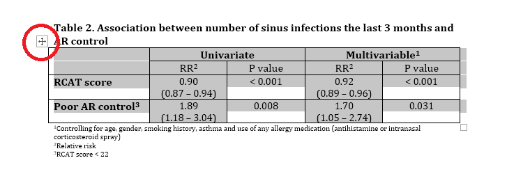
However, if you need to import an existing table or chart from Word or Excel, be sure to copy & paste just the table or chart first, then copy & paste the title or any captions separately. Otherwise it will convert to a low-resolution image that will look choppy at full poster size. In Word, move your mouse over the table until you see the selection icon in the upper-left corner of the table. Then click copy or type CTRL+C.
 Now paste into your poster file using the option for "Use Destination Theme" to match the rest of the poster, or "Keep Source Formatting" to retain colors and font styling from the original Word or Excel file. This should result in live data that can now be formatted within the poster file.
|